
How to Design a Website That Actually Gets Views

Think fast: You have less than 8 seconds to convince your readers to stay on your website. If a visitor to your site doesn’t see an intriguing headline or well-crafted landing page within those first few seconds, they will usually leave right after.
What does this mean for you?
Simple. You need to craft a compelling site that encourages visitors to stick around. When most people design a site, the goal is to convert visits to sales. However, most people don’t know how to design a site to convert, which is why they usually hire a website designer.
Whether you are hiring a designer or are attempting to do the site yourself, it’s a good idea to educate yourself on some dos and don’ts of site design. Just having that little bit of knowledge can save you valuable time and money.
Dos and Don’ts
A site could do exponentially better by following a few simple techniques:
- Use images to help guide users on where they should look next.
- Create a simple landing page with a clear call to action.
- Offer an incentive to get people to sign up for your newsletter.
- Include social media sharing buttons.
The idea behind this is guiding the user to make the decision you’d like them to. You need to make things easy and provide social proof that other people have made the decision before. Include logos and testimonials from your clients, and social media sharing icons. (Bonus points if your icons populate how many shares an article has received.)
Want to convert to sales? Make sure you test your site. Start with headlines, call to action, images, and copy. By testing a few ideas on how viewers react, you will find which one converts the best.
Here are a few other statistics you might find useful:
- 39% of website visitors will leave a site if images take too long to load. (Source: Go-Globe)
- 85% of website visitors believe a business’s mobile site should be as good as or better than their desktop site. (Source: Curatti)
- 44% of website visitors will leave a company’s website if there’s no contact information present. (Source: KoMarketing)
- 38% of website visitors will leave a site if the content/layout is unattractive. (Source: Go-Globe)
Avoid giving too much information and keep things as simple as can be while still providing quality content. Think of designing a website like going on a first date with someone. You only have a few moments to make a first impression so you want to make sure that everything looks good on presentation. When you sit down to enjoy dinner with your date, they’ll view your content and see if that is something they’re interested in. Using some of the tips we described should give you a head start on impressing your viewer.
The methods above aren’t the only methods of success, though. In fact, one of the most underrated methods is actual eye-scanning (i.e. how people read a website). When crafting your site, design it for the reader, including how they might look at it.
How Does Eye-Scanning Work?
The image below shows where most people look first. By using this as a guideline, organize your pages with the most important information on select parts of the site. The red section (upper left corner to upper middle of the website) is the first place people look. The yellow section shows the next place people tend to look, and the green section shows the far right upper corner, and footer as the last place people look on a website.
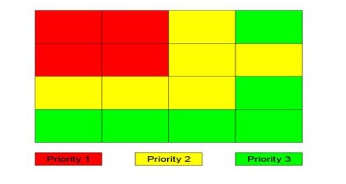
Source: Conversionxl.com
People also read websites differently. Most read in an F-shaped pattern. This means they read the horizontal line at the top of the screen, down the left side, and the middle of the screen.
The image below lays out a few other examples of how people read including the Z-shaped pattern. The goal with either design is to write catchy copy and display images strategically. Help guide your viewers to look where you want them to. Remember to keep your paragraphs short and relevant, concentrating on one idea in each paragraph. (Also, bullet points will be your best friend.)
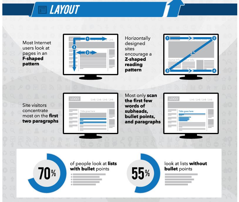
Source: InstantShift.com
Next time you design a site, we hope you take a little extra time to plan it right so you have the highest conversion from it.
What is your best tip for designing a website? Share in the comments below!