
What Colors Inspire Visitors to Click On Your Link?
Knowing that 94% of people mistrust or leave a website because of web design, it’s no surprise business owners spend so much time and money putting together their company websites. This would explain the thousands of tips found all over the web.
Make every page intriguing like a landing page.
Declutter and minimalize your site as much as possible.
Invest in a good photographer and polished logo.
These are great and all, but there’s more to web design than the actual designing. In fact, we often forget about one of the largest factors in design that has nothing to do with sizing, placement or anything: color schemes. Almost as quickly as loading time and content, a site’s color scheme can be a fast deciding factor on whether a visitor will stay on your site or move to the next. To figure out which color would look best for a site, it’s good to get down to the basics, starting with the psychology behind colors.
What Does Each Color Mean?
People associate different colors with various feelings, sensations, and emotions. Here are some of the most common color associations:
Red — Urgency, excitement, love, energy, courage, anger, passion
Orange — Determination, endurance, strength, optimism
Yellow — Happiness, joy, intellect, energy, youth
Blue — Calmness, honesty, loyalty, friendliness, trustworthiness
Green — Relaxation, growth, envy, money, health, youth, harmony
Purple — Royalty, creativity, imagination, luxury, spirituality, wealth
White — Goodness, innocence, purity, perfection
Black — Elegance, power, prestige, peace, mystery
Depending on what type of feeling you’re trying to uncover in your potential clients and website visitors, it’s wise to keep the color schemes consistent. The following Color Emotion Guide is a great resource to see how other major brands have used colors to convey meaning.
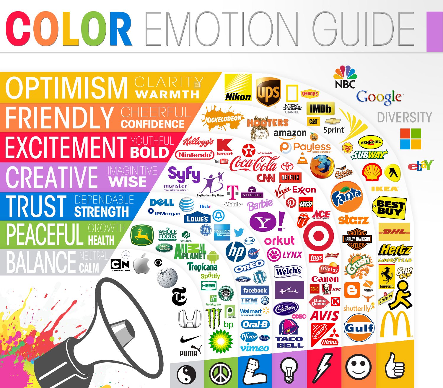
Retrieved from Visually
What Makes People Click?
It’s no secret color impacts human behavior. Think about your target customer and what they want when deciding on colors. Business2Community has a great list on which colors lead to sales conversions. It starts with red, the color of power. Blue, pink, yellow, green, purple, gold, orange, brown, and black follow behind. WordStream offers a great checklist for colors if you’re looking to make some call to action buttons.
Dark colors are better than lighter colors for higher traffic (2% vs. 1.31%), page views (2.98 vs 2.91), bounce rate (44.4% vs. 46.2%), and average time spent on the site (3.18 seconds vs. 3.15 seconds). That doesn’t mean dark colors are best in every website design scenario, though. You want to use a color palette that is consistent with your logo and other marketing materials. This is because color can increase web recognition by 80%.
A quick tip: If you think back to your art class, you probably have worked with a color wheel at one time or another. A color wheel shows how opposite colors complement one another. The idea is that the color that is across from the other is the complementing color, so they are a great combination in ads, website design, and other visuals. Think: yellow complements violet, blue complements orange, and yellow-green complements red violet. Use the color wheel when deciding what colors look best together.
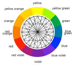
Retrieved from Sessions College for Professional Design
Tell us, what colors stick out to you the most on websites and logos?